Solid Design System
Solid is built on Bootstrap with additional structure layered on top: a token system that drives visual consistency, component conventions that prevent two developers from implementing the same thing differently, and state handling that covers the interactive cases Bootstrap leaves to you. The Bootstrap foundation means existing knowledge transfers. The Solid conventions mean markup produced independently by different developers looks like it came from the same person.
This page covers the system architecture, how the component inventory is organized, the token layer, and the state philosophy behind interactive components. If you are evaluating Solid for a project, read this before looking at individual components. Understanding the structural decisions makes the component choices make sense.
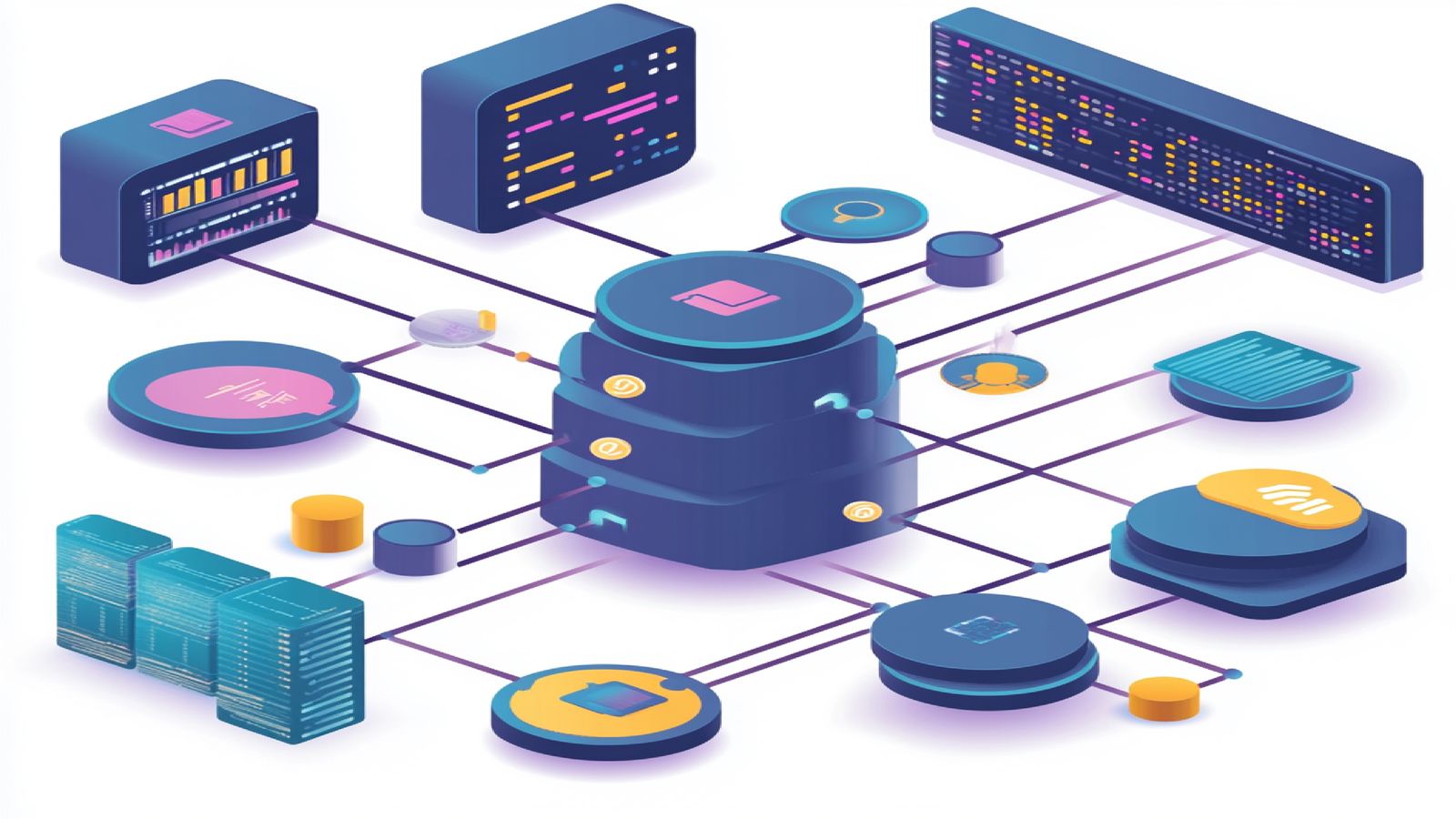
System Architecture
Three layers, each with a defined scope. Changes at a lower layer propagate upward. Teams that understand this structure customize the system without breaking things — teams that don't tend to accumulate inconsistencies that compound over time.
Token Layer
The token layer defines the raw values every component references: colors, spacing increments, font sizes, border radii, shadow definitions. Expressed as CSS custom properties, grouped by category.
Color tokens use semantic names instead of palette references.--solid-color-primary rather than --blue-500. The practical benefit: shift the primary color across the entire system by updating one token. No component contains a hardcoded hex value.
Spacing follows a 4px base scale from --solid-space-1 through --solid-space-16. The constraint is deliberate. One-off spacing values are where design system consistency dies — a constrained scale forces decisions that stay coherent rather than accumulating arbitrary pixel adjustments.
Typography tokens pair each size with a calibrated line height, so applying a heading style gives you the complete typographic treatment, not just a font size. It prevents the common mistake of changing text size without adjusting leading, which produces text that is technically the right size but visually crowded or loose.
Component Layer
Components contain HTML structure, CSS, and optional JavaScript. Every component references tokens exclusively — no hardcoded colors, no arbitrary pixel values. That constraint is what makes theming possible without editing component source files. Need a dark mode or a client-specific palette? Update tokens, not components.
Each component lives in its own directory with markup, styles, and a documentation page describing its API and usage. Self-contained. You can audit, update, or remove a component without side effects elsewhere in the system.
Layout Layer
The layout layer is page-level structure: containers, grid systems, responsive utilities. It sits above the component layer because layouts compose components into pages, not the other way around. Solid ships with a 12-column grid, flexbox utilities, and a small set of page templates for the common cases: dashboard, documentation, marketing landing page, settings panel.
Component Inventory Structure
Components are organized into five categories based on function. This is not cosmetic labeling. It determines the dependency rules: higher-category components can depend on lower-category ones, but not the reverse. A card can contain a button. A button should never import anything from a card. That constraint prevents circular dependencies and keeps component weight predictable.
Primitives are the atoms: buttons, inputs, labels, badges. They depend only on tokens. Composites combine primitives into reusable patterns — form groups, card headers, list items with actions. They depend on primitives and tokens.
Containers hold other components and manage visibility or layout: cards, modals, drawers, accordions. Navigation components handle movement: navbars, sidebars, breadcrumbs, pagination. Feedback components communicate system status — alerts, toasts, progress indicators, spinners — and are mostly standalone, depending only on tokens and primitives.
Token Foundations
The token system runs at two tiers. Global tokens define the raw palette and scales. Component tokens map those globals to specific properties within a component.
In practice: --solid-color-primary resolves to #2563eb. The button component then defines --solid-btn-bg: var(--solid-color-primary). Want to change only the button background? Override the component token. Want to shift the primary color everywhere? Override the global token. One value, every component that references it updates.
The two-tier structure solves the surprise cascade problem — where updating a global value breaks something three components removed from the change. It also makes theming straightforward: swap the global token set and you have a new theme without touching any component source files.
Component State Philosophy
Every interactive component in Solid has its states defined explicitly before any developer touches it. Not just default and hover. All of them: default, hover, focus, active, disabled, loading. Each state has documented visual changes and behavioral expectations.
The focus state gets particular attention. Solid uses a visible focus ring on all interactive elements, not just links. That is non-negotiable for keyboard accessibility, and it is also the first thing most teams quietly remove when the default style doesn't match their design direction. Solid makes that a deliberate override rather than an accidental omission.
Hover feedback is defined for pointer devices. Touch devices skip it. Loading states replace component content with a spinner or skeleton during async operations so the layout doesn't shift. Disabled components use reduced opacity and pointer-events: none — still visible in the UI, never interactive.
The practical benefit: developers do not invent these states per-component. The system provides them. Overriding a state requires an intentional token override, not an ad hoc CSS patch that accumulates silently across the codebase.
Working with Solid
To start using Solid in a project, see the Getting Started guide for installation and configuration instructions. To explore the component library with live examples, visit the Solid Demo page.
For product details and licensing, see the Solid Design System product page or browse the full design systems catalog.