Identity demo
This walkthrough breaks down every section of the Identity landing page template with realistic content and layout commentary. Instead of showing components in isolation, you will see how they connect into a complete page narrative. The goal is to demonstrate how Identity handles real content flow, not just visual polish.
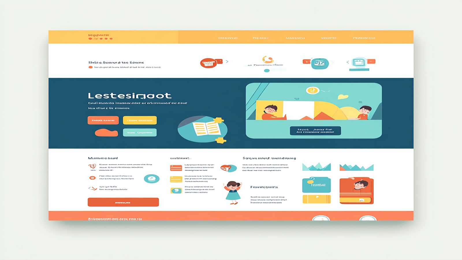
Every landing page lives or dies by its first screen. The Identity hero section is built around a single constraint: the visitor should understand what you offer and why it matters before they scroll. That means one clear headline, one supporting paragraph, and one visual element. No sliders, no animated carousels, no competing messages.
The hero layout places the headline and supporting text on the left with an optional image or product screenshot on the right. On screens wider than 1024 pixels, the two elements sit side by side in a 7/5 column split. The text column gets more horizontal space because the headline needs room to breathe at display sizes. On tablet and below, the layout stacks vertically with the text above the image.
Pay attention to the vertical spacing within the hero. The headline, paragraph, and call to action button follow a spacing rhythm that creates a clear reading order. There is enough gap between the headline and the paragraph to let the headline register as a standalone statement, but not so much that the paragraph feels disconnected. This micro level spacing is the difference between a hero that scans cleanly and one that feels like a random arrangement of text blocks.
The hero background supports solid colors, gradients, and full bleed images. The demo uses a subtle gradient that provides contrast for the text without competing with the product screenshot. If you use a background image, the template includes an overlay layer that ensures text legibility regardless of the image content.
Immediately below the hero, Identity places a social proof strip. This is a narrow section that typically holds client logos, trust badges, or a short metric callout. Its position is deliberate. The visitor has just read your headline and formed an initial impression. Before asking them to invest attention in your feature explanations, you provide a quick credibility signal.
The proof section in the demo shows a row of client logos in a muted grayscale treatment. The grayscale is not an aesthetic choice but a functional one. Full color logos compete with each other and with the surrounding content. Grayscale logos communicate the partnerships without pulling attention away from the sections that follow.
Placement matters more than you might think. Social proof at the top of a page creates a subconscious permission structure. The visitor sees recognizable names and decides the page is worth reading further. Move that same social proof to the bottom and it becomes a footnote. Identity places it early because early validation improves scroll depth.
The section supports three layout modes: a horizontal logo strip, a metric callout grid with numbers and labels, and a compact testimonial row. You can combine these, but the demo uses logos alone because simplicity at this position outperforms complexity. Save the detailed testimonials for later in the page where the visitor has more context.
The core of any landing page is the feature explanation. Identity organizes features in alternating two column blocks. The first feature places an image on the left and text on the right. The second reverses to image right, text left. The third alternates back. This zigzag creates visual motion down the page and prevents the flatness that comes from repeating the same layout.
Each feature block supports a section overline, heading, description paragraph, and an optional bulleted list of specifics. The overline is a small, muted label above the heading that categorizes the feature. It serves as a scanning aid for visitors who scroll quickly. Without it, every section heading carries equal weight and the page reads as a uniform list rather than organized categories.
The images in the demo use a consistent aspect ratio and are wrapped in a container with a subtle border radius and shadow. This treatment creates visual separation between the image and the surrounding content. The shadow is intentionally light. Heavy shadows look dated and create a floating effect that works against the grounded, professional tone that Identity aims for.
Notice how the text blocks are vertically centered against their paired images on desktop. This centering prevents the awkward whitespace that appears when a short paragraph sits next to a tall image. On mobile, the content stacks naturally with the image above the text, and the centering logic is replaced by standard block flow. The responsive transition is seamless because both layouts use the same spacing scale.
The demo includes three feature sections, but the template supports any number. Adding a fourth or fifth section does not break the alternating pattern. The CSS handles the odd and even logic automatically through nth child selectors. You add the markup and the layout alternation happens without manual class switching.
After the features, the page shifts from explanation to validation. The testimonial section in Identity uses a three column card layout on desktop that collapses to a single column on mobile. Each card includes a quote, attribution name, role, and an optional avatar.
The cards use a slightly elevated background and a top border accent that ties them to the site color scheme. The quote text is set in a slightly larger size than body copy to give it emphasis without resorting to italic or decorative quotation marks. The attribution sits below the quote in a smaller, muted treatment.
Three testimonials is the sweet spot for most landing pages. One feels insufficient. Two creates an awkward asymmetry on a three column grid. Four or more pushes the section too long and dilutes the impact. The demo uses three because it fills the grid naturally and provides enough social proof without overwhelming.
If you have strong metric based results rather than quote based testimonials, the section also supports a stat grid layout where each card shows a large number, a label, and a short explanation. This works well for B2B products where specific outcomes carry more weight than qualitative praise.
The final section is a full width CTA block with centered text and a prominent button. The design is intentionally constrained. One headline, one supporting sentence, one button. By this point in the page, the visitor has absorbed the hero promise, seen the proof, understood the features, and read the testimonials. The closing CTA should not introduce new information. It should simply provide a clear path to the next step.
The button in the CTA section uses the primary brand color and is sized larger than buttons elsewhere on the page. This sizing creates a visual anchor that draws the eye even if the visitor is scrolling quickly. The surrounding whitespace is generous, isolating the CTA from the content above and the footer below.
The demo shows the CTA against a tinted background that contrasts with the white sections above. This background shift signals that the page content is complete and the visitor has reached a decision point. The color change is subtle but effective at marking the transition from information to action.
Identity works best when the content follows a linear narrative. Product launches, service descriptions, agency portfolios, and feature announcements all fit this pattern. The template is less suited for pages that need complex navigation, multiple conversion paths, or deep content hierarchies. For those scenarios, a multi page structure will serve better than a single landing page.
The template excels when you have strong visuals to pair with your content. The alternating feature sections rely on images or screenshots to create visual rhythm. If your content is entirely text based, you may find the layout feels unbalanced. In that case, consider using icons or abstract illustrations in the image positions to maintain the visual cadence.
Browse the full page templates collection to compare Identity with other landing page approaches. If you are ready to evaluate the template for a project, the page template products page has the details you need to get started.