Exodus demo
Exodus is a landing page template for projects that want to make a strong visual statement without sacrificing usability. This walkthrough examines every section of the template with realistic content, explaining the layout decisions that make unconventional compositions work and identifying the line where boldness starts undermining clarity.
Most landing page templates default to symmetric layouts because symmetry is safe. A centered headline, evenly spaced columns, mirrored sections: these create a page that is predictable and inoffensive. But predictable is not always effective. When every SaaS product, agency, and startup uses the same centered layout, visual sameness becomes a competitive disadvantage. Visitors process symmetric pages on autopilot because they have seen the same structure hundreds of times before.
Exodus uses asymmetry as a tool for attention management. When elements are unevenly positioned, the eye has to work slightly harder to parse the layout. That extra processing creates engagement. The visitor is paying attention rather than skimming. The key word is slightly. Too much asymmetry creates confusion. The right amount creates interest.
The template achieves this through offset grids, unequal column splits, and deliberate whitespace imbalances. But every asymmetric choice is anchored by a consistent underlying grid. The content may appear to break the rules, but the spacing, alignment, and proportions still follow a structured system. This is the difference between designed asymmetry and visual chaos.
The Exodus hero section pushes the headline to the left third of the viewport and places the supporting visual element in the right two thirds. This is not a standard two column split. The text column is deliberately narrow, which forces the headline to break across more lines and creates a vertical text block that contrasts with the horizontal image.
This layout choice has a practical benefit beyond aesthetics. A narrow text column with a large adjacent image creates a clear focal point hierarchy. The visitor reads the text first because it occupies less space and feels like the natural starting point. The image registers in peripheral vision and pulls the eye rightward after the text is processed. You get sequential attention rather than split attention.
The hero background in the demo uses a dark treatment with light text. Dark backgrounds feel weightier and more immersive than white backgrounds. They also create a stronger transition when the page shifts to lighter sections below. That transition, from dark hero to light content, signals to the visitor that the introduction is over and the substance is beginning.
One detail worth noting: the hero button is positioned below the text but aligned to the left edge of the text column, not centered. This left alignment maintains the asymmetric composition and avoids the visual disconnect that happens when a centered button sits below left aligned text. Small alignment choices like this are what make unconventional layouts feel intentional rather than accidental.
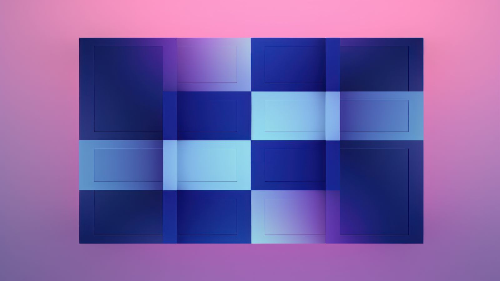
The feature sections in Exodus use a grid that shifts the content container off center. Instead of a standard centered 1200 pixel container, the content area aligns to the left on odd sections and to the right on even sections. The opposite side gets a large scale image or background element that bleeds to the viewport edge.
This edge bleed is the most visually distinctive element of the Exodus layout. It creates a sense of expansiveness that contained layouts cannot achieve. The image extends beyond the normal content boundary, which makes the page feel less like a boxed document and more like an immersive environment. The effect is particularly strong on wide screens where the bleed distance is most apparent.
The content within each section remains fully readable despite the unconventional positioning. Text columns maintain a maximum width of approximately 520 pixels, which keeps line lengths in the optimal range for reading. The offset affects the position of the text block on the page, not its internal typography or spacing. This separation between macro layout and micro typography is critical. You can be bold with positioning and conservative with readability at the same time.
On tablet and mobile screens, the offset grids collapse to a standard centered layout. The edge bleed images become contained within the normal content flow. This responsive behavior is deliberate. Asymmetric layouts need horizontal space to function. On narrow screens, the same offset positioning would push content too close to one edge and waste the other. The template adapts rather than forcing a layout that does not suit the viewport.
Exodus uses typography more aggressively than a typical template. Section headings are set at display scale, significantly larger than the body text. The size contrast between headings and body copy is intentional. In an asymmetric layout, large headings serve as visual anchors that orient the reader within the page structure. Without them, the offset content blocks could feel disconnected from each other.
The display headings in the demo use a tight letter spacing and a heavier weight than standard heading styles. Tight letter spacing at large sizes creates density, which counterbalances the generous whitespace elsewhere on the page. If the headings used default letter spacing, they would feel too airy and lose their anchoring function.
Body text remains at a conventional size and weight. This is important. The headings can be dramatic because the body text is restrained. If both elements competed for visual attention, the page would feel noisy rather than bold. Good unconventional design is about contrast between dramatic and quiet elements, not about making everything dramatic.
The template also uses a monospace font for overlines and metadata labels. This secondary typeface adds texture to the page without requiring additional decorative elements. The monospace treatment signals that certain text is categorical or functional rather than narrative. It is a small choice that contributes to the overall feeling that the page was deliberately designed rather than assembled from default components.
Unconventional layouts perform well in specific contexts. Product launches benefit from visual distinction because the page itself communicates that the product is different. Creative agencies benefit because the page demonstrates design thinking through its own structure. Premium products benefit because the layout signals quality and intentionality.
Exodus works particularly well when the product or service has strong visual assets. Photography, product screenshots, illustrations, and video thumbnails all gain impact from the edge bleed sections and large scale image treatment. If your project has compelling visuals, Exodus gives them room to create impact. The layout amplifies good imagery in a way that conventional centered templates cannot match.
B2C products, creative tools, design services, and lifestyle brands tend to benefit from the Exodus approach. The visitor expects a certain level of visual sophistication and the template delivers it through layout rather than decoration. There are no gradients, animated backgrounds, or visual gimmicks. The boldness comes entirely from composition and proportion.
Not every project benefits from asymmetry. Enterprise software, financial services, healthcare products, and compliance heavy industries often need layouts that communicate stability and predictability. A bold offset layout can read as reckless in contexts where trust depends on conveying reliability. Know your audience before choosing a template that prioritizes visual impact over visual comfort.
Content heavy pages also struggle with unconventional layouts. If your landing page needs long form explanations, comparison tables, or detailed pricing breakdowns, the offset grids create awkward text positioning. Exodus is optimized for pages with concise content blocks and strong visuals. If your content is primarily text, a more conventional template will serve it better.
Accessibility is another consideration. Asymmetric layouts can create challenges for screen readers and keyboard navigation if the visual order does not match the DOM order. Exodus handles this by keeping the source order logical regardless of visual positioning. The CSS transforms manage the visual offsets without reordering the underlying markup. But if you customize the layout significantly, you need to verify that the reading order remains sensible when the visual layout is removed.
Internationalization presents practical challenges as well. Offset layouts designed for left to right reading do not automatically work for right to left languages. Exodus includes RTL support that mirrors the offset directions, but you should test thoroughly if your audience includes RTL readers. The mirroring is structural, not just directional, so the visual hierarchy inverts correctly.
Exodus represents one end of the layout spectrum. If the bold approach resonates with your project, use the demo sections as a starting point and customize from there. If you want to compare it with more conventional options, the page templates collection shows all available landing page templates side by side.
The choice between conventional and unconventional layouts is not about which is better in the abstract. It is about which serves your specific content, audience, and goals. A bold layout with the wrong content is worse than a conventional layout with the right content. Start with what you need to communicate, then choose the structure that amplifies that message.
For pricing and package details, visit the page template products page. Every template in the collection, including Exodus, uses the same spacing system and responsive foundation, so switching between templates during the evaluation phase is straightforward.